How designers think about layout
March 28, 2020
A designer looking at the white space below this paragraph just sees space as a first class entity. But a web developer is likely trying to decide which adjacent box gets margin.
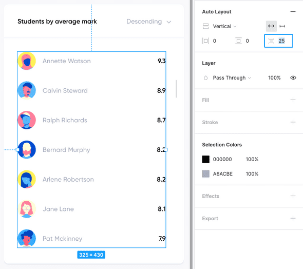
As web developers, our reality has been shaped by endless hours of browser tetris. Meanwhile, our design counterparts are playing god mode in tools like Figma. The items in the list below — by way of Figma’s Auto Layout feature — are simply 25 pixels apart:
We don’t want our final implementations to be limited by browser dynamics. We want the opposite: working with code should match the way designers think.
To reach that goal, we need to allow designers to express themselves at a higher level, while also unburdening developers from pixel adjustments. We need to develop a shared language of layout.
Pixel annotations are too ambiguous
A handoff between a designer and a developer usually involves these types of annotations (which are intentionally left incomplete):
While pixel and hex annotations are always helpful, they open the door to one off implementations. They are artifacts of “static-land” and are still quite removed from our target medium, the browser. A developer still has to map these pixels onto adjacent boxes in a browser.
We can close the door to this implementation ambiguity by creating generic layout components.
Layout components
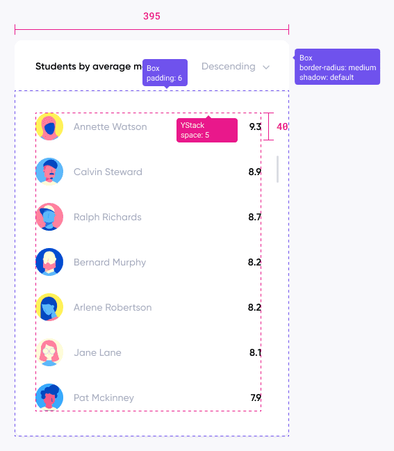
Contrast the previous mockup with the one below.
Notice the similarities to Figma’s Auto Layout feature: the YStack component uses 5 base units (*5px = 25px) between it’s items. Rather than requiring the developer to interpret padding in relation to the border above the list, the designer is able to directly convey their intentions: 6 units of padding (note the possible specificity of paddingX, paddingY, paddingLeft etc.) belong to this Box below the border.
YStack and Box are examples of “layout components”: their sole job is to manage the space around their children. Note that in the case of a single child, this definition encompasses border and box-shadow styles (e.g. the outer Box above).
Isolating layout comes with another, equally beneficial effect. Pulling out all of our layout logic into dedicated components allows for our actual components to be much more versatile. A component shouldn’t know or care what type of layout it is apart of. If the list item component above was implemented with 25px either above (:not(:first-child)) or below (:not(:last-child)), it would require rework before it could be used in a context with different “density”.
Crowd out ambiguity
By creating code abstractions that mirror the way designers think about layouts, we can crowd out the pixel slinging ambiguity that leads to restricting one-off implementations. Layout components put the ownership of these abstractions back in the hands of their rightful owners, designers.

